Using Data Visualization to Reduce Energy Costs in Commercial Buildings
As the cost of energy continues to rise, businesses are looking for ways to reduce their consumption and save money. One of the most effective ways to do this is by using data visualization to identify areas of energy waste and opportunities for improvement. In this article, we will explore the benefits of data visualization for reducing energy costs in commercial buildings and provide some practical examples of how it can be implemented.

What is Data Visualization?
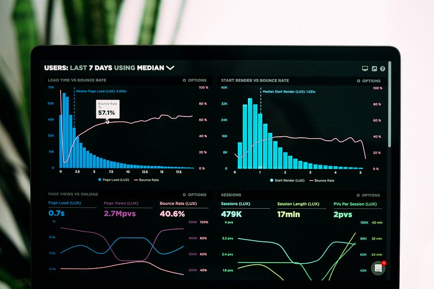
Data visualization is the practice of using charts, graphs, and other visual aids to represent complex data sets in an easy-to-understand format. By presenting information in a visual format, it becomes easier to spot patterns and trends that might be missed when looking at raw data. In the context of energy management, data visualization can help building owners and managers identify areas of inefficiency and waste, and take action to reduce energy consumption.
How Can Data Visualization Help Reduce Energy Costs?
By using data visualization tools, building owners and managers can gain insight into how energy is being used in their facilities. They can track energy consumption in real-time, identify peak usage periods, and compare energy usage across different areas of the building. This information can be used to identify areas of inefficiency and waste, such as equipment that is running when it shouldn’t be, or areas of the building that are being over-heated or over-cooled.
One example of how data visualization can be used to reduce energy costs is through the use of energy dashboards. These dashboards provide a real-time display of energy usage and can be accessed from any device with an internet connection. This allows building managers to monitor energy usage from anywhere, at any time, and make adjustments as needed to reduce consumption and save money.
Another example of how data visualization can help reduce energy costs is through the use of heat maps. Heat maps provide a visual representation of energy usage across different areas of the building, making it easy to identify areas of high usage and target them for energy-saving measures. For example, if a heat map shows that a particular area of the building is consistently using more energy than other areas, building managers can investigate why this is happening and take steps to reduce energy consumption in that area.
Practical Examples of Data Visualization for Energy Management
There are many different data visualization tools and techniques that can be used to reduce energy costs in commercial buildings. Here are a few practical examples:
· Energy dashboards: Real-time displays of energy usage that allow building managers to monitor usage and adjust settings as needed to reduce consumption.
· Heat maps: Visual representations of energy usage across different areas of the building that can be used to identify areas of high usage and target them for energy-saving measures.
· Comparative analysis: Comparing energy usage across different time periods or areas of the building to identify patterns and trends.
· Fault detection and diagnostics: Using data visualization tools to identify faults in building systems and equipment that are causing energy waste.
Data visualization is a powerful tool for reducing energy costs in commercial buildings. By using real-time data to identify areas of inefficiency and waste, building owners and managers can take action to reduce consumption and save money. From energy dashboards to heat maps and comparative analysis, there are many different data visualization techniques that can be used to improve energy management in commercial buildings. By investing in these tools and techniques, businesses can achieve significant energy savings and improve their bottom line.